One of the key Exam Skills that any exam board looks for is Analysis and, in my opinion, is arguably the most important of the 4 skills. But what does good Analysis actually look like?
A key mistake, and one that students often find hard to rectify is making the switch from what I term ‘story-telling‘ into higher level Analysis. By this I mean that students very often can tell me what is happening, but struggle to explain why it is happening. For example, a common essay questions might be one that asks students to explain 2 causes of Unemployment – the obvious choice here that students should talk about first is Cyclical Unemployment:
Poor Analysis that scores the lowest marks will just tell a story, and wont have much actual Economics in it. Maybe the student will talk about a Recession causing firms to need to lay workers off, but there won’t be any reference to much economic theory, and they’re unlikely to actually explain why a recession makes firms need to lay workers off. There probably won’t a (relevant) diagram either. Crucially, they probably explain what Cyclical Unemployment is, but not really why it occurs.
Good Analysis that scores respectable marks will move on from telling me a story and start to show some level of Analysis – but there may still be gaps in there. In our Cyclical Unemployment case, answers will tell me how, in a Recession, we often see falling incomes due to lower incomes. This lower income means there is less demand for goods + services, so AD falls. This means firms output les, need less labour as a result and will therefore sack workers. The good thing here is that the student is starting to develop chains of reasoning (which I’ll explain later). Additionally, there may be a diagram but it will be poorly used (i.e. the diagram will be correct, but the students hasn’t explicitly referred to specific shifts in the diagram or specific changes in Output, Price Level, Interest Rate, etc)
Great Analysis that scores top marks will be clinical in Analysis and will evidence clean, specific Chains of Reasoning in the response. In our example of Cyclical Unemployment, the response will be specific and use key terms in explaining how a Recession leads to falling incomes for consumers, thus decreasing levels of Disposable Income. These lower Disposable Incomes lead to a reduced level of Consumption for goods and services and, as a result, reduced AD. This lower Aggregate Demand will lead to a lower level of Real Output/GDP in the economy and, because of this, a lower Derived Demand for Labour in the economy as less Labour is needed to produce less Output. As a result, firms will lay workers off as they’re no longer needed. Additionally, students will have a diagram that is full labelled and is correct – and they will have referred to specific shifts of curves and decreases in Output.
Hopefully you can see what kind of things we’re looking for in higher-level Analysis, and if you’re looking for two key areas I often feel most students could improve on, here is 1 key recommendation I’d make: Effective Use of Diagrams
Effective Use of Diagrams
Diagrams are crucial to doing well in A Level or IB Economics, but making sure that you’re actually using them will push your Analysis up, no matter what level you’re operating at. The cardinal sin you can commit in Economics is to write the phrase “this is shown in the diagram” or “as seen in my diagram” without actually mentioning anything about the Diagram. Please never do this – you may as well have not drawn the diagram in the first place. Look at the Diagram on the Left – showing Cyclical Unemployment – and read the following effective use of the Diagram:
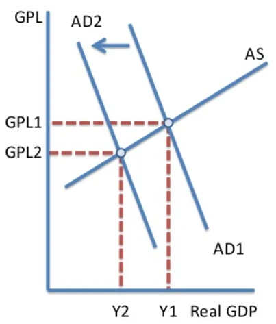
In a recession, Incomes will fall in the economy, meaning that consumers have less disposable income to spend on Goods and Services. This causes Aggregate Demand in the economy to fall (AD1 -> AD2 in the diagram) and, consequently this causes total Real GDP to fall (Y1 -> Y2). This fall of Output from Y1 to Y2 also means that firms now require less labour and, as such, the Derived Demand for Labour falls – causing Unemployment to rise.
As you can see I’ve referred not just to the diagram in general but I’ve referred to specific points, shifts and movement in the diagram – something you’ll have to do to get top-tier Analysis!
If there’s anything you’d like me to cover, follow me on the socials or email me!
